7 Principles of Visual Design in UX
- Authors

- Author
- Imam Abullaisi
Table of contents
- Visual design is a crucial aspect of user experience (UX). It shapes how users interact with digital interfaces, providing guidance, clarity, and a sense of brand identity. When executed well, visual design simplifies navigation, making users feel more at ease and confident with their interactions.

Key Principles of Visual Design
To create an effective visual design, certain foundational principles must be respected. These principles ensure that interfaces are intuitive and engaging while aligning with user expectations.
1. Scale
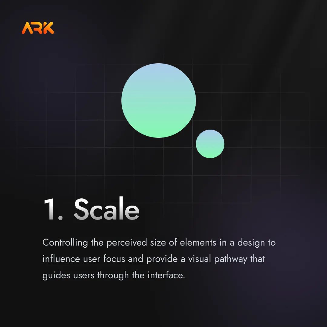
Scale is about controlling the perceived size of elements in a design to influence user focus. By carefully selecting the scale of elements, designers highlight the most important components and provide a visual pathway that guides users through the interface. For instance, in an e-commerce site, the primary “Buy Now” button is often larger and brightly colored compared to secondary elements like navigation links, directing immediate attention to the desired action.
Conversely, smaller text or less prominent images encourage a more relaxed browsing pace. Designers can create harmony by ensuring that the scale relationship between all items aligns with the intended flow, leading to a consistent and effective user journey.
2. Hierarchy

Visual hierarchy ensures that the content is presented in a way that logically and clearly prioritizes information. By varying the size, color, contrast, and position of various design elements, designers can establish an intuitive order that aligns with how users naturally scan a page. Headlines typically command attention due to their size and weight, while smaller text indicates secondary or supplementary information.
Effective use of hierarchy leads users through the intended path, ensuring key messages and calls to action stand out clearly. For instance, a landing page might present a bold headline to hook interest, followed by concise subheadings and imagery that progressively builds the case for conversion. Each visual element must contribute to this logical progression, reinforcing the desired structure.
3. Balance

Balance is essential for creating a sense of stability and structure in visual design. There are two main types: symmetrical and asymmetrical balance. Symmetrical balance divides a design into mirror-image halves, creating order and harmony. This approach can evoke feelings of reliability and calmness.
In contrast, asymmetrical balance uses contrasting elements that aren’t identical but complement each other in weight, position, or color. Asymmetry introduces visual tension while ensuring cohesion, giving a more dynamic feel to the design. Designers skillfully blend these forms to keep layouts visually interesting and pleasant, avoiding areas that are too “heavy” or “empty.” Proper balance guides user focus smoothly across the interface, reducing distractions.
4. Contrast

Contrast is a critical principle that makes significant features stand out from the background or surrounding elements. By using differences in color, size, shape, and other visual properties, designers can create differentiation between various sections or actions on the interface. High contrast between a button and its surrounding space makes it immediately noticeable, increasing the likelihood of engagement.
Contrast isn’t just about color; it can be achieved through light and shadow, varying fonts, or distinctive textures. Too little contrast makes designs feel flat and confusing, while strong contrast grabs attention and clearly defines the relationships between different elements.
5. Gestalt Principles

Gestalt principles explore how the mind naturally groups visual elements to perceive them as unified wholes. Our brains automatically connect related components based on principles like similarity, proximity, continuity, and closure. Similar items are perceived as belonging together, while proximity draws associations between closely placed objects.
Continuity helps users follow an uninterrupted path across a design, and closure fills in visual gaps to complete familiar shapes. By understanding and leveraging these principles, designers can create interfaces that align with human perception and guide users effortlessly. For example, grouping related options in the navigation menu simplifies decision-making, while arranging product images in a grid pattern helps users compare items easily.
6. Consistency
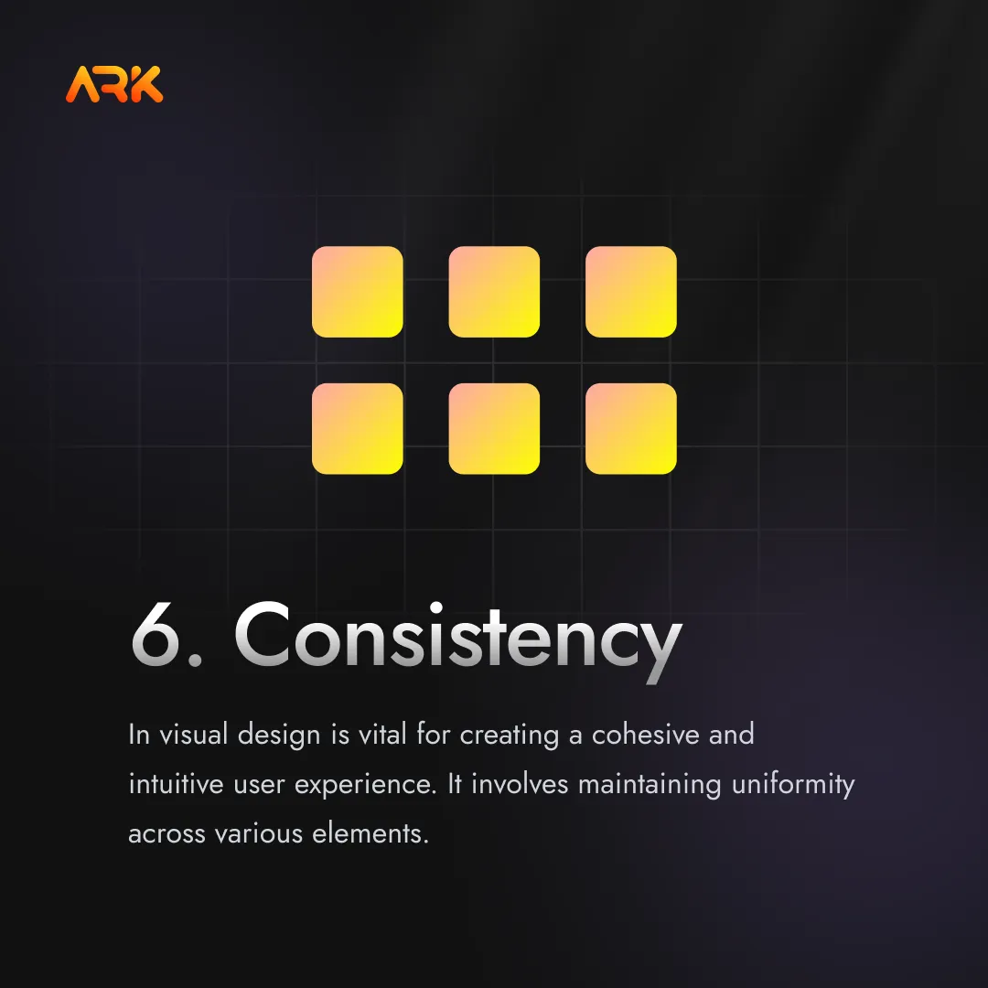
Consistency in visual design is vital for creating a cohesive and intuitive user experience. It involves maintaining uniformity across various elements such as fonts, colors, buttons, and layouts. When these elements are consistent, users can easily recognize patterns and predict interactions, which simplifies navigation and enhances usability.
Consistent design reduces the learning curve for new users, allowing them to quickly become familiar with the interface. This familiarity builds trust and confidence, encouraging users to engage more deeply with the app or website. Additionally, a uniform visual style contributes to a polished and professional appearance, reinforcing the brand identity and creating a memorable user experience.
7. White Space
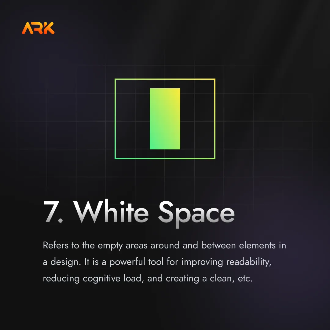
White space, or negative space, refers to the empty areas around and between elements in a design. It is a powerful tool for improving readability, reducing cognitive load, and creating a clean, uncluttered interface. White space allows elements to breathe, making it easier for users to focus on and process the information presented.
Proper use of white space can highlight important elements, create a sense of elegance, and improve overall user experience. It helps in organizing content, preventing information overload, and guiding the user’s eye through the interface in a natural and intuitive way.
Conclusion
Visual design principles form the backbone of creating intuitive and engaging user interfaces. By understanding and applying concepts like scale, hierarchy, balance, contrast, and Gestalt principles, designers can craft UIs that guide users effortlessly and provide clarity at every step. Case studies from Spotify, Google, and Netflix illustrate how these principles make products easier to navigate and more visually compelling.
Incorporating common patterns, such as responsive layouts and clear navigation, ensures that the interface consistently meets user expectations. Applying these design principles and best practices results in cohesive, user-centered digital experiences that feel natural and satisfying.