Visual Design Principles: Best Practices and Case Studies from Top Apps
- Authors

- Author
- Imam Abullaisi
Table of contents
- Case Study Examples Illustrating Principles
- 1. Spotify (Scale & Hierarchy):
- 2. Google Search (Balance & Contrast):
- 3. Netflix (Gestalt Principles & Consistency):
- 4. Instagram (Scale & White Space):
- 5. Amazon (Hierarchy & Contrast):
- 6. Airbnb (Hierarchy & White Space):
- 7. Trello (Consistency & Gestalt Principles):
- Conclusion
- Now we come to the example of applying visual design principles in UI design: the more we recognize, the more likely we will improve the overall user experience of our design. Here are case study examples that illustrate these principles and some best practices to consider.
Case Study Examples Illustrating Principles
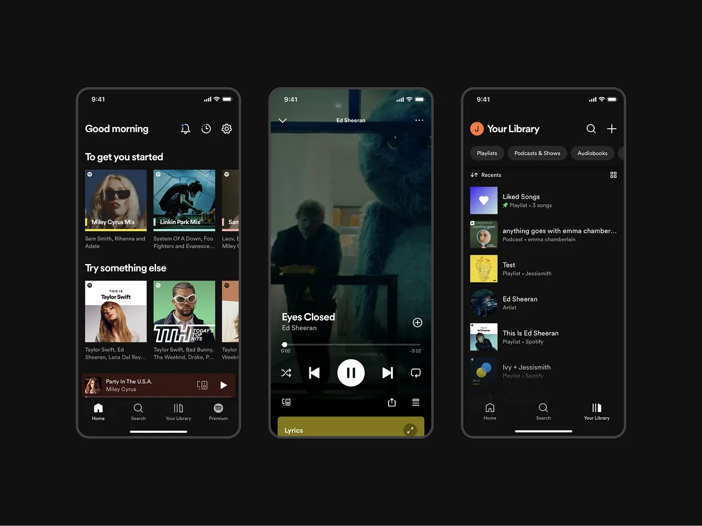
1. Spotify (Scale & Hierarchy):
Spotify’s mobile app is a prime example of how effective hierarchy and scale can enhance user experience. In the “Home” section, Spotify prominently features curated playlists and recommended tracks. The “Play” button is larger and visually distinct to catch immediate attention, while playlist and album artwork provide a visual identity that helps users navigate quickly. The “Your Library” section organizes saved songs, playlists, and podcasts in a way that reflects user habits, while different font sizes and colors clearly separate content types.
2. Google Search (Balance & Contrast):
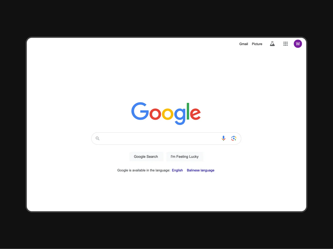
Google’s search homepage is celebrated for its minimalism and ease of use. The large central search bar dominates the screen, creating a focal point that eliminates distractions. This design leverages symmetrical balance, with the search bar directly centered, and a contrast between the colorful Google logo and the clean white background. Below the search bar, two contrasting buttons offer direct action options, with ample white space around them that further emphasizes their importance.
3. Netflix (Gestalt Principles & Consistency):
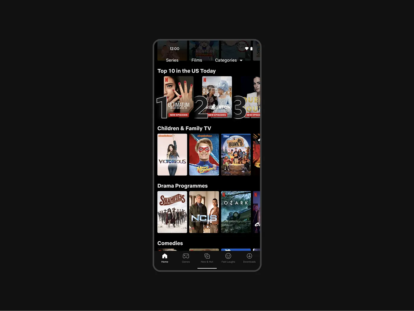
Netflix employs Gestalt principles like grouping, proximity, and similarity in its UI design. It uses a grid system to categorize shows and movies into easily recognizable groups based on user preferences, genres, and recommendations. Each row contains similar thumbnails of content, ensuring users can quickly recognize and connect to their interests. Consistency is maintained through uniform thumbnails and playback controls, which provide an uninterrupted browsing experience.
4. Instagram (Scale & White Space):
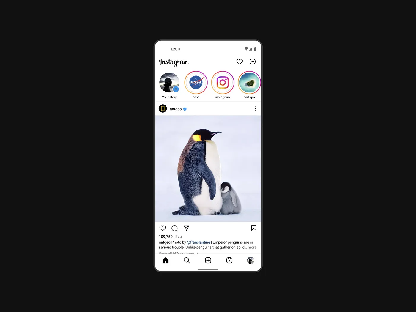
Instagram effectively uses scale to highlight key actions and content. The “Like,” “Comment,” and “Share” buttons are prominently placed under each post, making interactions intuitive. Ample white space around images and text ensures the content stands out, making the interface clean and easy to navigate.
5. Amazon (Hierarchy & Contrast):
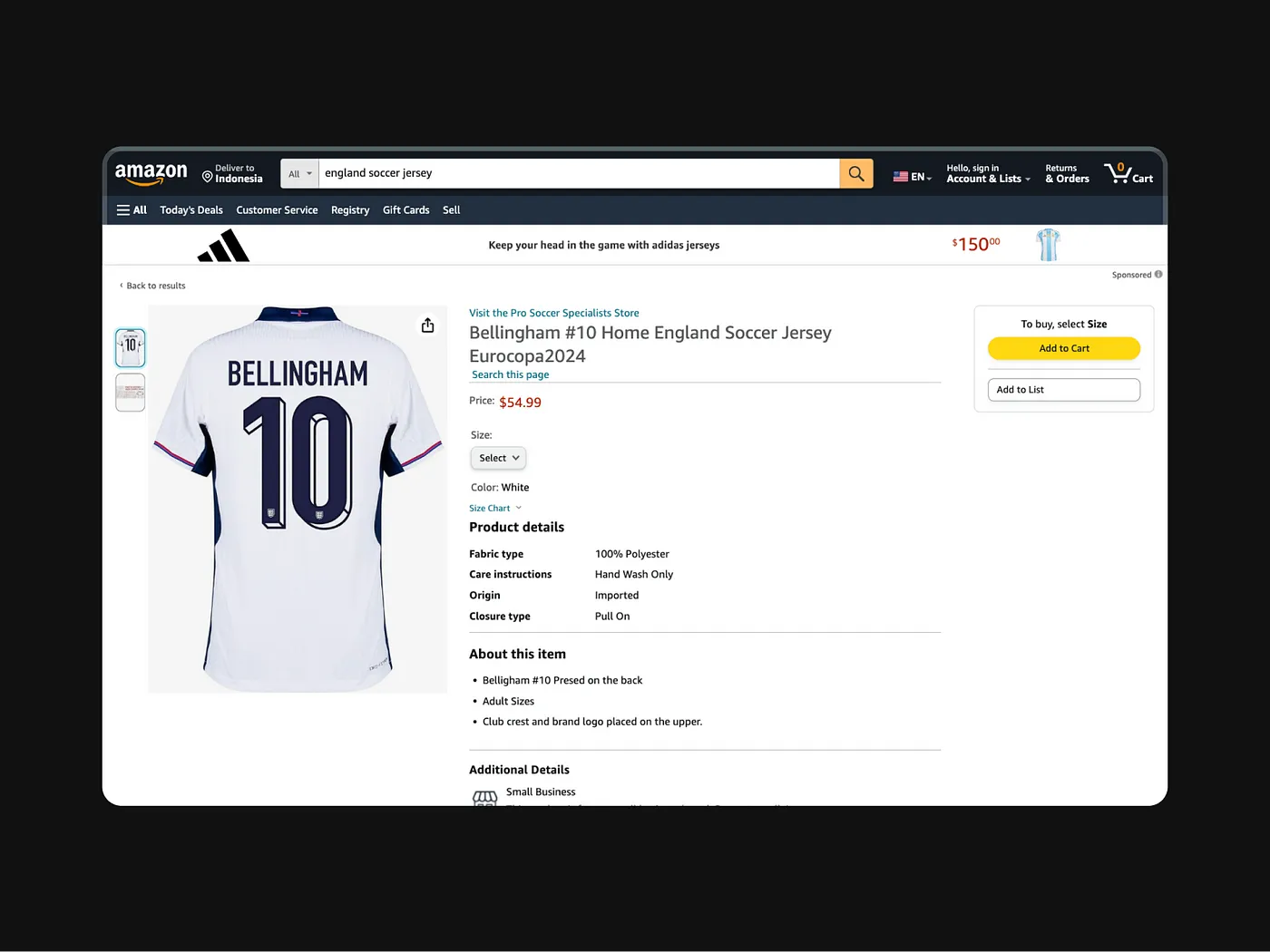
Amazon’s product pages demonstrate excellent use of hierarchy and contrast. Key information like product titles and prices are prominently displayed in larger, bolder fonts. Contrasting colors are used for call-to-action buttons like “Add to Cart” and “Buy Now,” ensuring they stand out against the rest of the page.
6. Airbnb (Hierarchy & White Space):
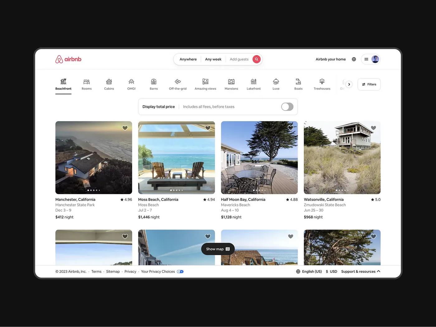
Airbnb’s app design excels in using hierarchy and white space to create a seamless user experience. The search bar and navigation icons are strategically placed at the top, providing a clear starting point for users. Listings are aligned in a grid format with ample white space between them, making the interface clean and easy to navigate. Each property card is consistently structured with images, titles, and prices, guiding the user’s eyes naturally from one element to the next. This use of hierarchy and white space enhances readability and makes the browsing experience fluid and enjoyable.
7. Trello (Consistency & Gestalt Principles):
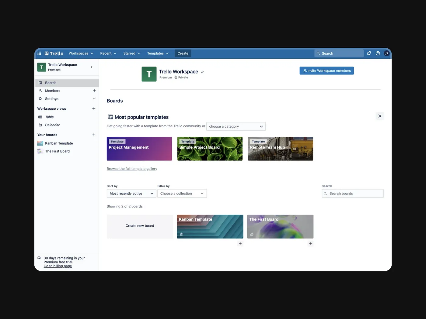
Trello uses consistency and Gestalt principles effectively to create an intuitive and organized interface. Each board and list follows a uniform design, with consistent fonts, colors, and button styles. This consistency helps users quickly recognize and understand the functions of different elements. Trello also leverages Gestalt principles such as proximity and similarity by grouping related tasks and lists together, making it easier for users to manage and navigate their projects. The combination of consistency and Gestalt principles ensures a cohesive and user-friendly experience.
Conclusion
By examining these case studies, it’s clear that applying visual design principles like scale, hierarchy, balance, contrast, Gestalt principles, consistency, and white space can significantly enhance the user experience. These principles help create interfaces that are not only visually appealing but also intuitive and functional.
Top apps like Spotify, Google, Netflix, Instagram, and Amazon demonstrate the impact of thoughtful design. They show how prioritizing user needs and expectations leads to successful and engaging digital products. By incorporating these best practices, designers can create user interfaces that stand out, simplify navigation, and foster a deeper connection between users and digital products.
Implement these principles in your own projects to elevate your UI design and provide users with seamless, enjoyable experiences. How will you use these insights to improve your designs? Let’s continue the conversation!